
Dropdowns are essential when creating forms in Angular. Most forms contain dropdowns, and the Ng-Select npm package is a great tool for creating a dropdown that fits all scenarios.
This article will guide you through the basic functionalities and use cases of Ng-select with example-driven explanations to help you create your first powerful dropdown.
Ng-select Initial Setup
Start by creating your application using the following command:
ng new exampleThis will create a new Angular application named example. If you’re unfamiliar with Angular’s initial setup, check out this Angular setup guide to learn more.
Next, navigate to your application folder.
cd exampleYou can either create a new component with the command below or use the app.component.ts file for testing:
Install the Ng-Select package in your application using this npm command.
npm install @ng-select/ng-select@11The 11 indicates the version of Ng-Select. The version should match your Angular app version, so check the README to find the correct version for your setup.
"node_modules/@ng-select/ng-select/themes/default.theme.css"Once installed, check your package.json file to ensure it’s listed properly. Next, include the above line in the styles section of your angular.json file (located under example->architect->build->styles) to ensure that all styles are imported correctly:

Implementing Ng-Select in Your Application
Now comes the implementation. To enable the use of Ng-Select, add NgSelectModule to your app.module.ts (or any other relevant module) so that the entire module can access this package.
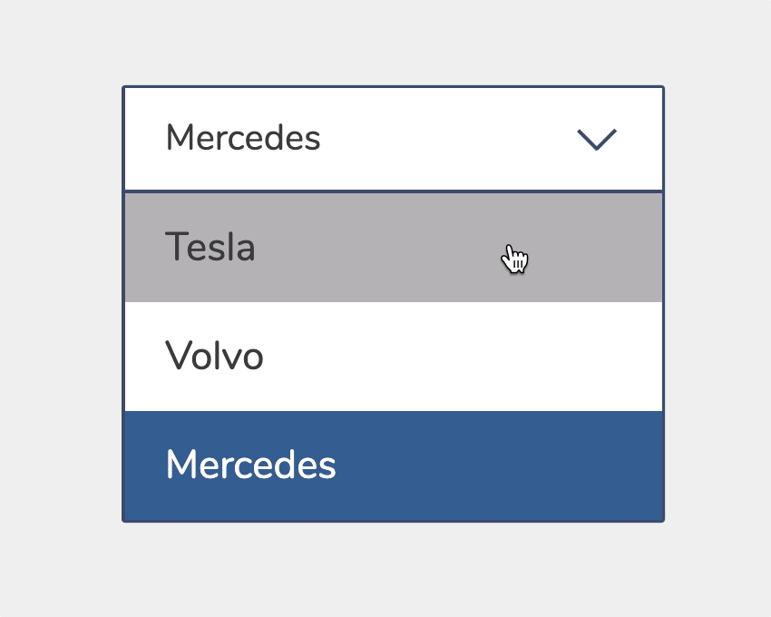
Next, open the HTML file and add the following code to create your first Ng-Select dropdown:
<ng-select
  [items]="list"
  [bindLabel]="label"
  [bindValue]="value"
  [multiple]="false"
  [clearable]="true"
  [placeholder]="Select the item"
  (add)="onAdd($event)"
  (remove)="onRemove($event)">
</ng-select>
Explanation of Properties:
items: Adds the list of options to be displayed in the dropdown.bindLabelandbindValue: These are useful when the list consists of objects with multiple keys. They allow you to bind specific values and labels for each option.multiple: Toggles between single and multiple selection modes.clearable: Adds a button to clear all selected values.placeholder: Defines the placeholder text.add: Triggered when new items are selected from the dropdown. This is particularly handy in multiple-selection mode.remove: Same as add but triggered when a selected item is removed.
This is the basic implementation for your Angular application. You can also add ngModel or formControlName to capture the selected value and process it as needed.
Import the CommonModule and Form modules(ReactiveFormsModule or FormsModule) based on your needs.
Note: FormsModule and ReactiveFormsModule represents two different types of forms templateForms and ReactiveForms in angular.
For single selections, the output will typically be a string or number depending on the input list. However, in multiple-selection mode, the result will always be an array.
Custom Templates in Ng-Select
Now, let’s consider a scenario where you have a list of student details like their first name, last name, and role number, as shown below:
[
  { firstName: "Francis", lastName: "Kafka", roleNumber: 1 },
  { firstName: "George", lastName: "Orwell", roleNumber: 2 }
  ...
];
Here we want to show the student’s full name in options by keeping the role number as a value.
<ng-select
  [items]="list"
  [bindLabel]="firstName"
  [bindValue]="roleNumber"
  [multiple]="false"
  [clearable]="true"
  [placeholder]="Select the item"
  (add)="onAdd($event)"
  (remove)="onRemove($event)">
  <ng-template ng-label-tmp let-item="item">
    <span>{{item.firstName + ' ' + item.lastName}}</span>
  </ng-template>
  <ng-template ng-option-tmp let-item="item">
    <span>{{item.firstName + ' ' + item.lastName}}</span>
  </ng-template>
</ng-select>
ng-label-tmp: Customizes the label of the selected option.ng-option-tmp: Customizes the options displayed in the dropdown.

Conclusion
This guide has demonstrated how to use Ng-Select in Angular to create dynamic and customizable dropdowns.
With easy integration and advanced features like multiple selections and custom templates, It is a powerful tool for enhancing forms in Angular applications.
Try out the examples provided and explore additional customizations. Feel free to share your thoughts, and check out the full code on the github repo and live working example.
Checkout our other articles here:

The quality of your work here is outstanding. The design and writing style are both impressive. There’s a unique flair in your approach, and I’ll definitely return to see what else you have to offer.